Tutorial: Learn Mobile UI UX from Scratch (2026)
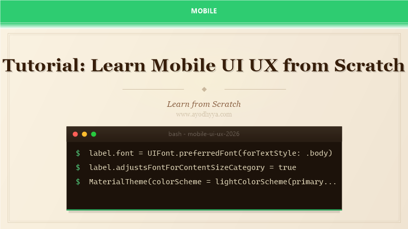
Mobile UI UX design is the difference between an app users love and one they delete after first use. I spent years writing code without understanding design principles, producing functional but ugly apps that users hated. Learning UI UX transformed my approach. Mobile design follows platform-specific guidelines: Material Design on Android and Human Interface Guidelines (HIG) on iOS. These guidelines provide standards for layout, typography, color, iconography, and interaction patterns. This tutorial covers the design process from user research through prototyping, visual design, and usability testing, with practical implementation for developers who want to improve their design skills.
Good mobile design prioritizes clarity, consistency, and feedback. Users should never wonder what a button does or whether their action registered. The design process starts with understanding the user's goals through research and personas, then moves to information architecture, wireframing, prototyping in Figma, visual design, and finally implementation with developer handoff. Usability testing with real users reveals issues that internal reviewers miss. Accessibility is not optional: Visual impairment, motor disabilities, and situational limitations affect a significant portion of users.
Platform Design Guidelines Overview
Apple's Human Interface Guidelines emphasize content-first design, clear navigation, and consistent use of system controls. Key principles: deference (UI recedes to let content shine), clarity (text is readable at every size), and depth (visual layers indicate hierarchy). Android's Material Design 3 is based on tactile surfaces, bold graphic design, and meaningful motion. It introduces concepts like elevation, motion choreography, and adaptive layout. Both guidelines support accessibility with dynamic type, high contrast modes, and screen reader support. Understanding both is critical because many apps target both platforms, and each platform's users have different expectations.
// iOS: Use system fonts for automatic Dynamic Type support
label.font = UIFont.preferredFont(forTextStyle: .body)
label.adjustsFontForContentSizeCategory = true
User Research, Personas, and Information Architecture
User research uncovers what users actually need, not what we assume they need. Methods include surveys, interviews, competitive analysis, and analytics review. Synthesize findings into personas representing target user segments, each with goals, frustrations, and behaviors. Information Architecture (IA) organizes content and screens into logical structures. Card sorting exercises help determine navigation categories. The sitemap documents the app's screen hierarchy. User flows map the paths users take to accomplish tasks. Identify the critical path (the most common task) and optimize it ruthlessly. Reduce friction by minimizing steps and cognitive load.
// User flow example: onboarding -> signup -> home
// Critical path: minimize screens and form fields
// Track drop-off with analytics on each step
Wireframing and Prototyping in Figma
Figma is the industry-standard design tool for mobile UI UX. Start with low-fidelity wireframes (grayscale boxes with placeholder text) to validate layout and navigation without visual distraction. Use Figma's auto layout and constraints to create responsive designs. Progress to high-fidelity mockups with real content, typography, colors, and icons. Prototyping connects screens with interactions. Figma prototyping supports transitions (slide, fade, push), overlays, and conditional logic with variables. Share the prototype with stakeholders for feedback. Use Figma's developer handoff tools to generate CSS, Swift, and Android XML attributes for implementation.
// Figma components for mobile design
// Auto layout: Set padding, spacing, and alignment
// Variants: Create button states (default, pressed, disabled)
// Export: Shift+Ctrl+E to export assets at @2x and @3x
Visual Design: Color, Typography, and Iconography
Color evokes emotion and reinforces branding. Use a primary color for key actions, a secondary color for accents, neutral colors for backgrounds, and semantic colors for feedback (success, warning, error). Ensure WCAG AA contrast ratios (4.5:1 for normal text). Typography choices affect readability and brand perception. System fonts (SF Pro for iOS, Roboto for Android) are safe choices. Limit to 2 font families and 3-4 text styles. Icons should be recognizable and consistent. Material Design Icons and SF Symbols provide platform-appropriate options. Use a 4dp/8px grid system for consistent spacing. Dark mode is now expected, with 80% of users preferring it for night use.
// Material 3 color tokens
@Composable val colors = lightColorScheme(
  primary = Color(0xFF6750A4),
  onPrimary = Color.White,
  background = Color(0xFFFFFBFE)
)
Microinteractions and Animation Principles
Microinteractions provide feedback for user actions and make the app feel alive. Examples: a button that depresses when tapped, a pull-to-refresh animation, or a heart icon that animates when favorited. Use timing (200-500ms for UI animations) and easing curves (ease-in-out for natural movement). Material Design's motion system defines shared axis transitions (parent-child navigation), fading through (card expansion), and container transform (morphing elements). iOS HIG prefers fluid, physics-based animations using UISpringTimingParameters. However, respect user preferences: respect the Reduce Motion accessibility setting on both platforms. Use SwiftUI animations or Compose's animate*AsState functions.
// Compose animation
val animatedSize by animateDpAsState(targetValue = if (expanded) 200.dp else 100.dp, animationSpec = spring(dampingRatio = 0.6f))
Box(modifier = Modifier.size(animatedSize).background(Color.Blue))
Usability Testing and Iteration
Usability testing validates designs with real users. Test early and often. Unmoderated remote testing with tools like Maze or UserTesting lets you collect quantitative data (task success rate, time on task, misclick rate). Moderated testing gives qualitative insights (frustration points, confusion, delight). Use the think-aloud protocol where participants verbalize their thoughts. For mobile specifically, test on both small and large screens, and consider one-handed use. Heatmaps and session recordings reveal where users tap, scroll, and pause. Iterate based on findings: fix critical issues before launch and track user satisfaction with CSAT or NPS scores post-launch.
// Maze testing plan
// Task: "Find and purchase item"
// Metrics: success rate >85%, time <30s, misclicks <2
Frequently Asked Questions
Do I need to be a designer to build good mobile UI?
No, but you need design awareness. Use platform components (system defaults look native), follow platform guidelines, and study existing apps with good design. Tools like Figma with templates lower the barrier for non-designers.
Should I use Material Design or iOS HIG for cross-platform apps?
Use each platform's native design system. Users expect platform-appropriate interfaces. A Material Design app on iOS feels foreign. Flutter and React Native support platform-specific components, or you can use a design system that adapts.
What screen sizes should I design for?
Design for 375x812 (iPhone 14 Pro) and 412x915 (Pixel 7) as primary sizes. Test on small devices (iPhone SE 320x568) and large devices (iPhone Pro Max, tablets). Use responsive layouts and adaptive constraints.
How do I ensure accessibility in mobile apps?
Support dynamic type, provide accessibility labels for screen readers, ensure contrast ratios, test with VoiceOver/TalkBack, and support assistive touch. Design with sufficient touch targets (44pt minimum). Accessibility benefits all users.
Originally published on Ayodhyyya. Last updated June 1, 2026.