Shadcn UI Tutorial: Learn Component Library from Scratch (2026)
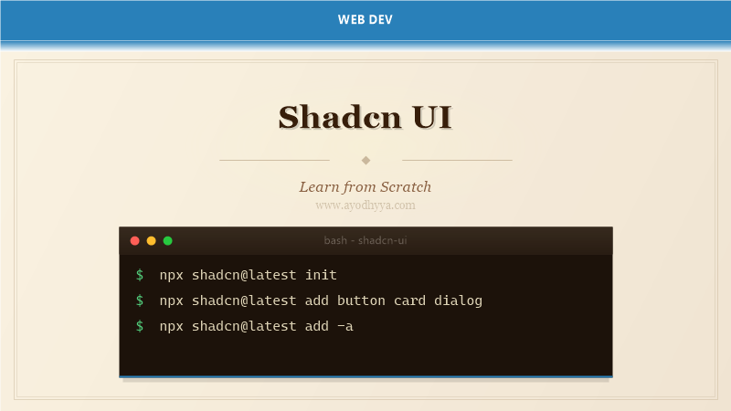
Shadcn UI is not a component library — it is a collection of re-usable components that you copy and paste directly into your project. Created by shadcn, this library provides beautifully designed, accessible React components built with Radix UI primitives and styled with Tailwind CSS. Unlike traditional component libraries shipped as npm packages, Shadcn UI components are your code to own and modify.
This approach means no dependency management, full customization, and zero bloat from unused components. Shadcn UI has become one of the most popular React component ecosystems since its release in 2023.
Installation and Project Setup
Shadcn UI requires a React project with Tailwind CSS. The init command creates the components.json configuration file, installs dependencies (Radix UI, clsx, tailwind-merge, lucide-react icons), configures CSS variables for theming, and sets up utility functions.
The configuration file defines where components are generated, the style variant, and Tailwind config overrides. Shadcn UI works with Next.js, Vite, Remix, Astro, and other React frameworks.
# Initialize Shadcn UI
npx shadcn@latest init

# You will be prompted:
# - Style: Default or New York
# - Base color: Slate | Gray | Zinc | Neutral | Stone
# - CSS variables: Yes / No

# Manual configuration (components.json)
{
  "$schema": "https://ui.shadcn.com/schema.json",
  "style": "default",
  "rsc": true,
  "tsx": true,
  "tailwind": {
    "config": "tailwind.config.ts",
    "css": "src/app/globals.css",
    "baseColor": "zinc",
    "cssVariables": true,
    "prefix": ""
  },
  "aliases": {
    "components": "@/components",
    "utils": "@/lib/utils",
    "ui": "@/components/ui",
    "lib": "@/lib",
    "hooks": "@/hooks"
  }
}

# Install individual components
npx shadcn@latest add button
npx shadcn@latest add card dialog dropdown-menu
npx shadcn@latest add table form toast

# All at once
npx shadcn@latest add -a
Component Architecture and Theming
Each Shadcn UI component is composed of Radix UI primitives wrapped with Tailwind CSS styling. For example, the Dialog component uses @radix-ui/react-dialog for WAI-ARIA compliance, while the visual appearance is fully controlled by your Tailwind theme.
The CSS variables approach enables dynamic theming — light and dark modes are handled via class-based CSS variables. The cn() utility handles class merging. Components accept all props from the underlying Radix primitive.
// Example: Button component (simplified)
// components/ui/button.tsx
import * as React from 'react';
import { Slot } from '@radix-ui/react-slot';
import { cn } from '@/lib/utils';
const buttonVariants = cva(
'inline-flex items-center justify-center whitespace-nowrap rounded-md text-sm font-medium transition-colors focus-visible:outline-none focus-visible:ring-1 focus-visible:ring-ring disabled:pointer-events-none disabled:opacity-50',
{
variants: {
variant: {
default: 'bg-primary text-primary-foreground shadow hover:bg-primary/90',
destructive: 'bg-destructive text-destructive-foreground shadow-sm hover:bg-destructive/90',
outline: 'border border-input bg-background shadow-sm hover:bg-accent hover:text-accent-foreground',
secondary: 'bg-secondary text-secondary-foreground shadow-sm hover:bg-secondary/80',
ghost: 'hover:bg-accent hover:text-accent-foreground',
link: 'text-primary underline-offset-4 hover:underline',
},
size: {
default: 'h-9 px-4 py-2',
sm: 'h-8 rounded-md px-3 text-xs',
lg: 'h-10 rounded-md px-8',
icon: 'h-9 w-9',
},
},
defaultVariants: { variant: 'default', size: 'default' },
}
);
export interface ButtonProps extends React.ButtonHTMLAttributes {
variant?: 'default' | 'destructive' | 'outline' | 'secondary' | 'ghost' | 'link';
size?: 'default' | 'sm' | 'lg' | 'icon';
asChild?: boolean;
}
const Button = React.forwardRef(
({ className, variant, size, asChild = false, ...props }, ref) => {
const Comp = asChild ? Slot : 'button';
return (
Form Components and Validation
Shadcn UI’s Form component is built on react-hook-form and Zod. It provides form field wrappers with automatic error states, labels, descriptions, and messages. FormItem, FormLabel, FormControl, FormDescription, and FormMessage compose together for consistent form layouts.
Integration with Zod schemas provides type-safe validation. The useForm hook from react-hook-form with zodResolver validates on every change or submission.
import { useForm } from 'react-hook-form';
import { zodResolver } from '@hookform/resolvers/zod';
import { z } from 'zod';
import { Button } from '@/components/ui/button';
import {
Form, FormControl, FormDescription, FormField, FormItem, FormLabel, FormMessage,
} from '@/components/ui/form';
import { Input } from '@/components/ui/input';
const formSchema = z.object({
username: z.string().min(2, 'Username must be at least 2 characters').max(50),
email: z.string().email('Invalid email address'),
bio: z.string().max(160, 'Bio must be under 160 characters').optional(),
});
function ProfileForm() {
const form = useForm({
resolver: zodResolver(formSchema),
defaultValues: { username: '', email: '', bio: '' },
});
function onSubmit(data) {
console.log(data);
}
return (
);
}Data Display: Tables and Data Grids
The Shadcn UI Table component provides semantic HTML table elements with consistent styling. For advanced data grids, combine Table with @tanstack/react-table for sorting, filtering, pagination, and row selection.
TanStack Table handles the logic; Shadcn UI handles the visuals. Define columns with accessor functions, enable sorting, add filtering, and implement pagination.
import { ColumnDef, flexRender, getCoreRowModel, getPaginationRowModel, getSortedRowModel, useReactTable, SortingState } from '@tanstack/react-table';
import { Table, TableBody, TableCell, TableHead, TableHeader, TableRow } from '@/components/ui/table';
import { Button } from '@/components/ui/button';
import { Input } from '@/components/ui/input';
type Post = { id: number; title: string; status: string; createdAt: string };
function DataTable({ data }) {
const [sorting, setSorting] = React.useState([]);
const table = useReactTable({
data,
columns: [
{ accessorKey: 'title', header: 'Title', enableSorting: true },
{ accessorKey: 'status', header: 'Status' },
{ accessorKey: 'createdAt', header: 'Created', cell: ({ row }) => new Date(row.getValue('createdAt')).toLocaleDateString() },
{ id: 'actions', cell: ({ row }) => },
],
getCoreRowModel: getCoreRowModel(),
getPaginationRowModel: getPaginationRowModel(),
getSortedRowModel: getSortedRowModel(),
onSortingChange: setSorting,
state: { sorting },
});
return (
table.getColumn('title')?.setFilterValue(e.target.value)} />
{table.getHeaderGroups().map(headerGroup => (
{headerGroup.headers.map(header => (
{flexRender(header.column.columnDef.header, header.getContext())}
))}
))}
{table.getRowModel().rows.map(row => (
{row.getVisibleCells().map(cell => (
{flexRender(cell.column.columnDef.cell, cell.getContext())}
))}
))}
);
}Dialogs, Modals, and Popovers
Shadcn UI’s dialog components use Radix UI primitives for full accessibility compliance — focus trapping, keyboard navigation, screen reader announcements, and ARIA attributes. Dialog, AlertDialog, Sheet, Popover, HoverCard, and Tooltip provide various overlay patterns.
The Dialog component includes DialogTrigger, DialogContent, DialogHeader, DialogFooter, DialogTitle, and DialogDescription. AlertDialog is for confirmation dialogs. Sheet slides in from any edge.
import { Button } from '@/components/ui/button';
import {
Dialog, DialogContent, DialogDescription, DialogFooter, DialogHeader, DialogTitle, DialogTrigger,
} from '@/components/ui/dialog';
import {
AlertDialog, AlertDialogAction, AlertDialogCancel, AlertDialogContent, AlertDialogDescription, AlertDialogFooter, AlertDialogHeader, AlertDialogTitle, AlertDialogTrigger,
} from '@/components/ui/alert-dialog';
import { Input } from '@/components/ui/input';
import { Label } from '@/components/ui/label';
function PostDialog() {
return (
);
}
function DeleteConfirm() {
return (
Are you sure?
This action cannot be undone.
Cancel
Continue
);
}Customization and Dark Mode
Shadcn UI uses CSS variables defined in globals.css for theming. Each color role has a light and dark variant. Colors use HSL values for easy manipulation. You customize the theme by editing these CSS variables — no component overrides needed.
Dark mode is toggled by adding the class ‘dark’ to the root HTML element. CSS variables automatically switch. The mode toggle component uses next-themes for persistence. Component variants map to CSS variable classes.
/* globals.css */
@tailwind base;
@tailwind components;
@tailwind utilities;
@layer base {
:root {
--background: 0 0% 100%;
--foreground: 240 10% 3.9%;
--card: 0 0% 100%;
--card-foreground: 240 10% 3.9%;
--popover: 0 0% 100%;
--popover-foreground: 240 10% 3.9%;
--primary: 240 5.9% 10%;
--primary-foreground: 0 0% 98%;
--secondary: 240 4.8% 95.9%;
--secondary-foreground: 240 5.9% 10%;
--muted: 240 4.8% 95.9%;
--muted-foreground: 240 3.8% 46.1%;
--accent: 240 4.8% 95.9%;
--accent-foreground: 240 5.9% 10%;
--destructive: 0 84.2% 60.2%;
--destructive-foreground: 0 0% 98%;
--border: 240 5.9% 90%;
--ring: 240 5.9% 10%;
--radius: 0.5rem;
}
.dark {
--background: 240 10% 3.9%;
--foreground: 0 0% 98%;
--card: 240 10% 3.9%;
--card-foreground: 0 0% 98%;
--popover: 240 10% 3.9%;
--popover-foreground: 0 0% 98%;
--primary: 0 0% 98%;
--primary-foreground: 240 5.9% 10%;
--secondary: 240 3.7% 15.9%;
--secondary-foreground: 0 0% 98%;
--muted: 240 3.7% 15.9%;
--muted-foreground: 240 5% 64.9%;
--accent: 240 3.7% 15.9%;
--accent-foreground: 0 0% 98%;
--destructive: 0 62.8% 30.6%;
--destructive-foreground: 0 0% 98%;
--border: 240 3.7% 15.9%;
--ring: 240 4.9% 83.9%;
}
}
// Usage: toggle dark mode
document.documentElement.classList.add('dark');
// Tailwind classes use CSS variables
Frequently Asked Questions
Is Shadcn UI a library or a framework?
Neither. It is a collection of copy-paste components. You own the code entirely. No npm dependency to manage — just install the components you need and customize them.
Does Shadcn UI work without Tailwind CSS?
No. Shadcn UI relies on Tailwind CSS and CSS variables for theming. Tailwind is a core dependency.
Can I customize Shadcn UI components?
Yes, and that is the main advantage. The components are copied into your project, so you modify them directly. Change colors, sizes, layouts — it is your code.
What is the difference between Shadcn UI and Material UI?", A: "Shadcn UI gives you full ownership of the code (copy-paste). Material UI is an npm dependency with a strict design system. Shadcn UI offers flexibility; MUI offers consistency out of the box.
Originally published on Ayodhyyya. Last updated June 1, 2026.